I am a strong conceptual copywriter, and I love working closely with graphic designers to create the most engaging way to communicate our client’s message.
Bark
2026 Consumer Electronics Show (CES) booth design
One of the places I shine the most is in group brainstorms. When we met to discuss our booth design for the largest consumer electronics show, I came up with an idea to help us stand out. Most booths for the conference are stark white, minimalist affairs. To counter that, I suggested we lean into nostalgia to help convey our messaging of old-school childhood with modern parental controls. My graphic designers truly excelled at bringing to life the idea of a best friend’s basement, complete with wood panelling, nostalgic wallpaper, and the feeling of being a kid again.
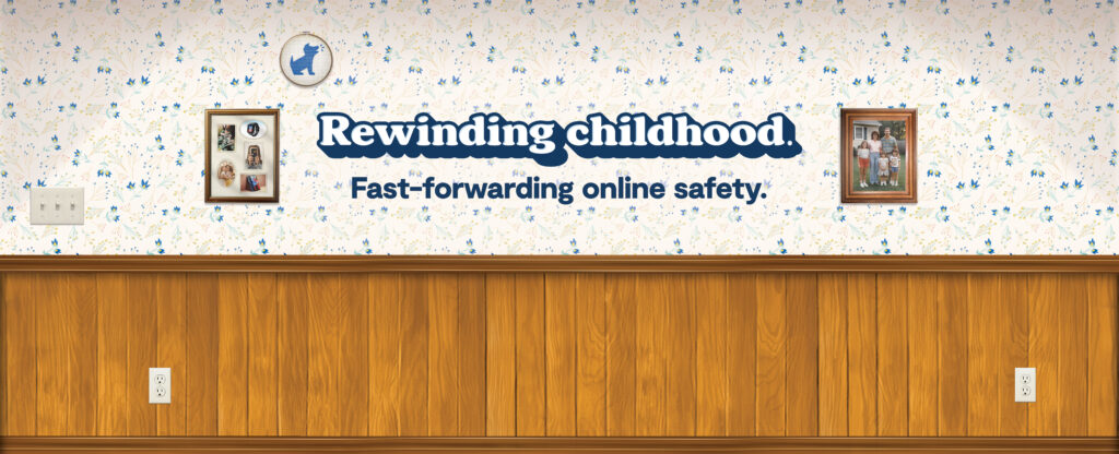
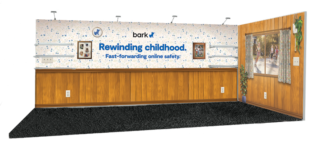
The booth performed well at CES, with our reps saying that attendees were drawn in and enjoyed spending a little analog time connecting among all of the hyper-tech modern booths that all ran together.
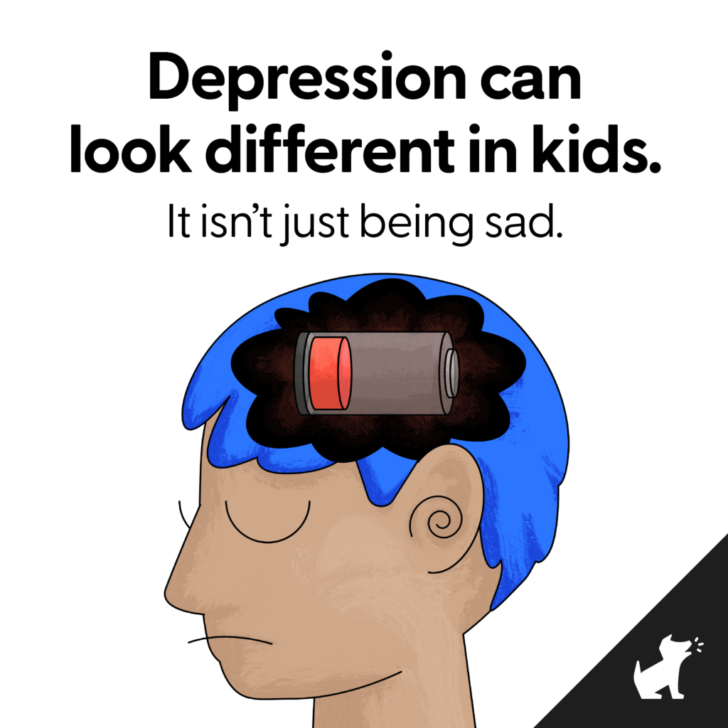
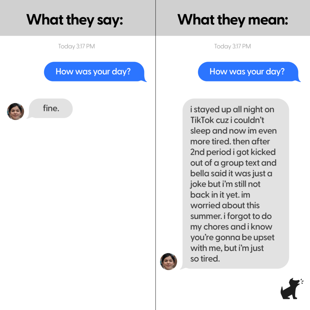
Depression analogy social post
The team was tasked with coming up with an organic social post that helped communicate how Bark can give insight into a teen’s state of mind. I came up with these two concept, which used technology analogies for how being drained actually feels to a child. The designer captured these two ideas perfectly, helping stop the scroll of countless parents.
Battery concept:
Text message translation concept:
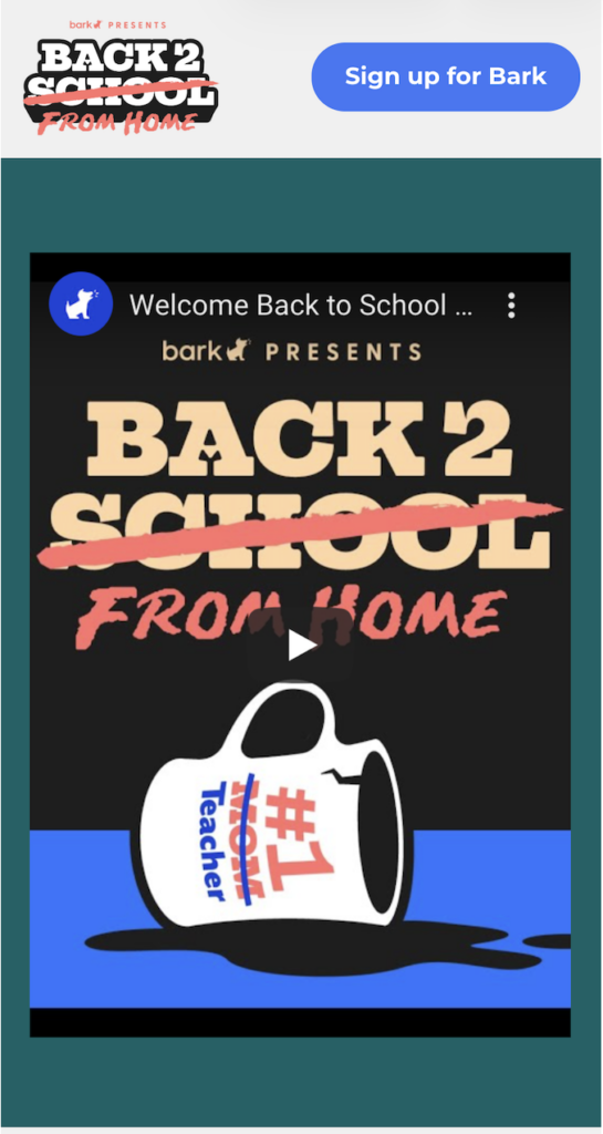
Pandemic school resources microsite
During COVID in 2020, we had to figure out how to revamp our annual Back to School campaign to reflect how remote learning was affecting families. I concepted the page design, leaning into the emotional and physical work that parents were having to do in this new normal.
Ye Olde Campaign
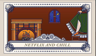
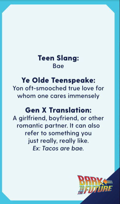
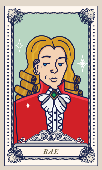
Much of the content I created at Bark was directed toward educating parents about the latest in teen and tween slang. We decided to do a humorous twist on the subject by adding in a third element: old-timey slang. We ended up printing these cards to give out as leave-behinds at a trade show, to much avail.

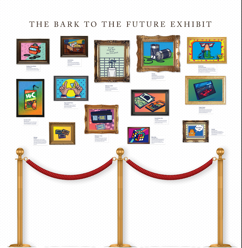
For the same conference, we curated a booth backdrop consisting of ancient millenial technology from the ’80s and ’90s. Click to enlarge and zoom!
Halloween infographic
I have to admit, my favorite part of this is maybe the Bark logo against the full moon looking like a werewolf.

Doctor.com
Standing out at B2B conferences and tradeshows can be extremely difficult, as most of the attendees are in the same field and utilize the same basic marketing collateral. For one conference, we decided to take a more risky approach, and it paid off. Taking inspiration from the 1980s Garbage Pail Kids, I developed personas that embodied the classic tropes from common online patient reviews in which negative feelings were evinced.


Girls Rock Camp Atlanta
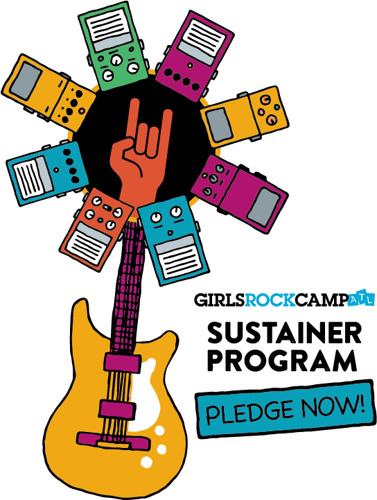
For Girls Rock Camp Atlanta, I came up with and developed the concept behind our inaugural Sustainer Giving Program. I worked to create something visually appealing that played on the double meaning of pedal/petal. After the debut of the program, enrollment skyrocketed, as it’s more than just a call for money, it’s a fun, rock’n’roll-oriented invitation to own a part of an organization that kids and families love
Children’s Healthcare of Atlanta
While working for Children’s Healthcare of Atlanta, I wrote for more than 20 different service lines, from the donor-centric Foundation to the more clinical groups like Orthopaedics and Marcus Autism Center. Within each service line, I crafted prose tailored for three main audiences: patient families, consumers and physicians.
Art on the BeltLine
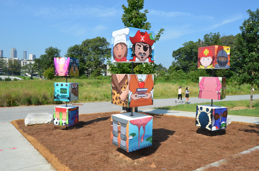
To commemorate the health system’s 100th anniversary, Children’s shared this piece of art with the city with the hope of giving kids—and kids at heart—an opportunity to create and revel in imaginative play. I developed the concept and wrote the grant proposal, while a graphic designer provided illustration and a furniture union constructed it.
The Imagination Totem is a customizable, interactive piece of art that aims to spark the curiosity and imagination of BeltLine visitors allowing them to create their own personalized, whimsical characters. Viewers can rotate each cube and create the character that they feel inspired to bring to life. The totems are meant to evoke creativity in a tactile way and harken back to the days of childhood when anything was possible.
Signs
These huge, 6 ft x 20 ft banner signs were to be hung on wrap-around fencing on one of our construction sites. They’re meant to be general Children’s-branded advertisements highlighting the pediatric differential but also eye-catching and fun.
Posters
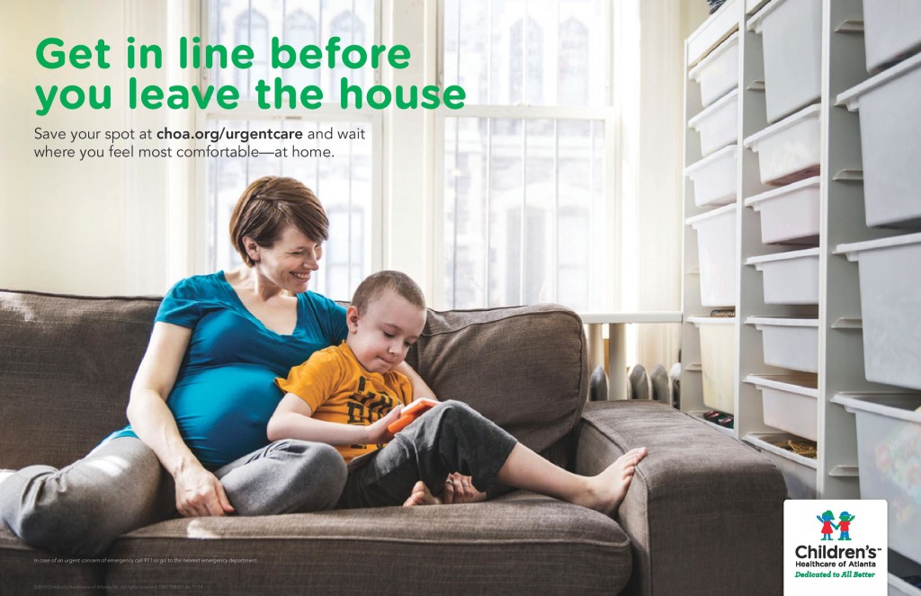
For this Urgent Care campaign, we chose to highlight the best part of online scheduling and communicate it to our key audience–moms with kids and a busy schedule. We figured out that the hard part of waiting isn’t the waiting room itself, it’s being unable to feed the kids or keep them on their own schedule. This campaign was meant to appeal to that sense of comfort.
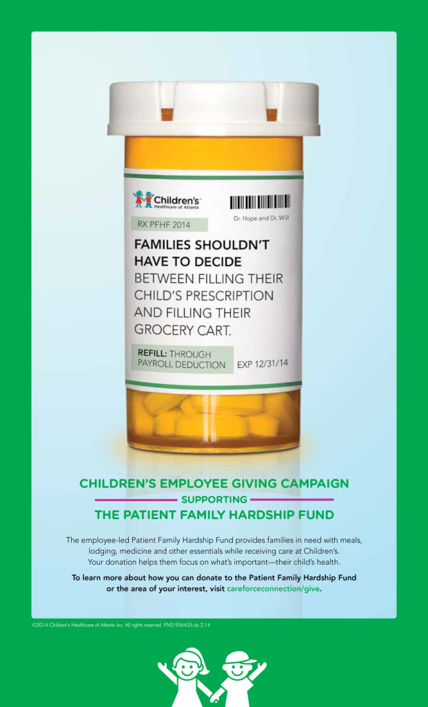
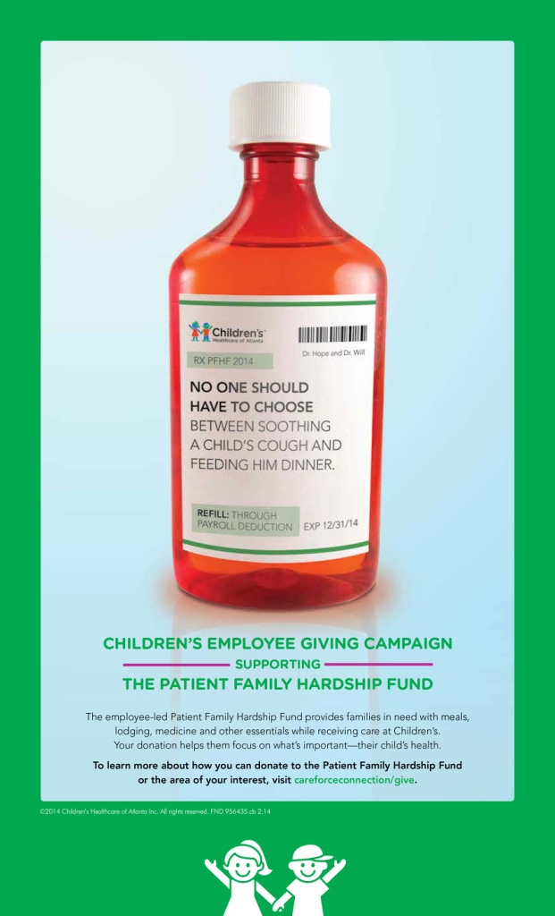
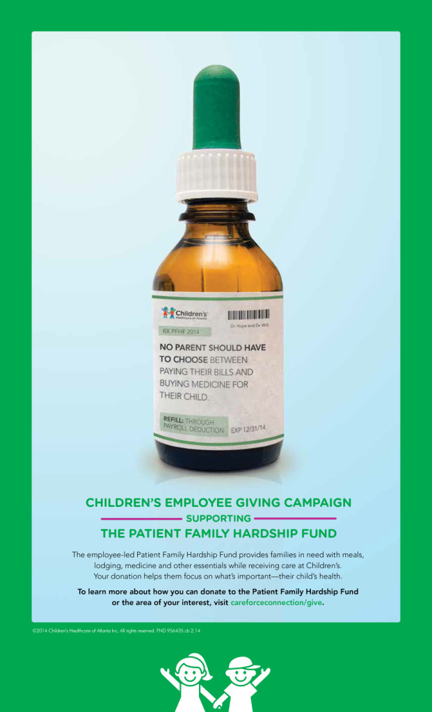
These posters were displayed internally at our hospitals as part of an annual employee giving campaign. Asking employees at a non-profit institution to donate isn’t an easy task, so I framed it in a different way than in the past. Instead of focusing on the generosity of nurses, we shifted the focus to the patients in greatest need.
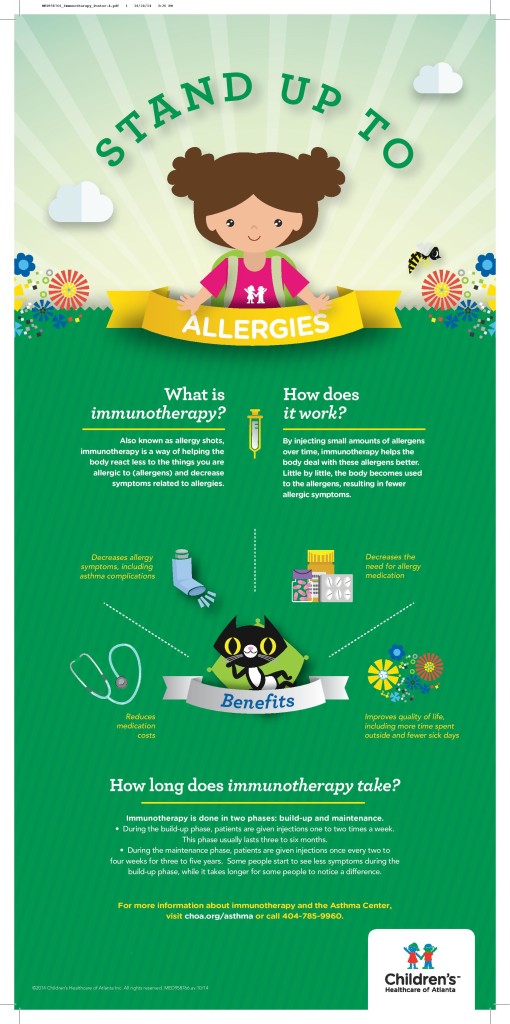
For this poster, we were told to create an informational poster about allergy shots. This is an incredibly hard sell, because no kids want weekly shots, and no parent wants to make twice-weekly trips to the doctor for three years. Keeping in mind that success for this project won’t be measured in efficacy–the client knew that allergy shots are a hard sell, we instead chose to make the client as happy as possible with the information presented as un-clinically as we could. I chose to frame the message not as merely “Get Allergy Shots,” but rather in a more defiant, positive manner. Telling consumers that they have an intriguing option–and to ask your doctor to learn more about it–goes much further than scaring them off at first blush with the mention of injections.
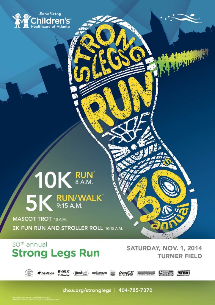
This poster was a refresh for the 30th anniversary of the race. Inspired by the bright, vibrant and collectible posters common in marathons and bridge runs. We decided to incorporate the skyline to help brand it further as an Atlanta tradition.
Social media graphics
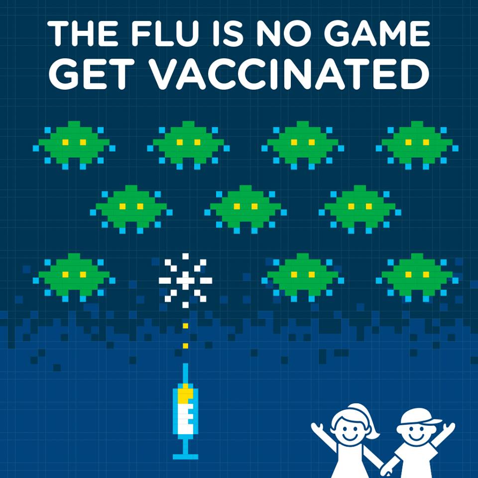
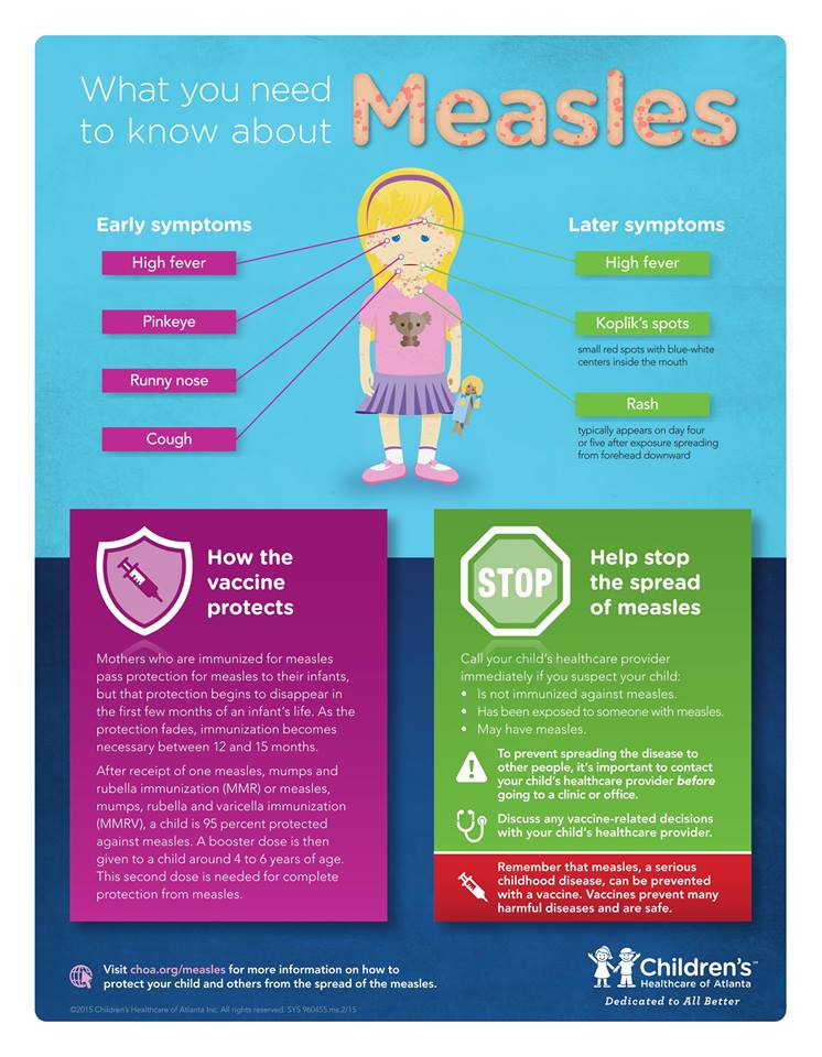
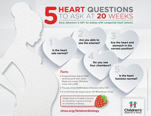
Children’s has a strong Facebook presence with over 100,000 followers and active commenters, so social media graphics are used a clearinghouse for disseminating public health messages. Copy is usually limited, but I worked tirelessly with the designer to co-create the visual concepts for these pieces.
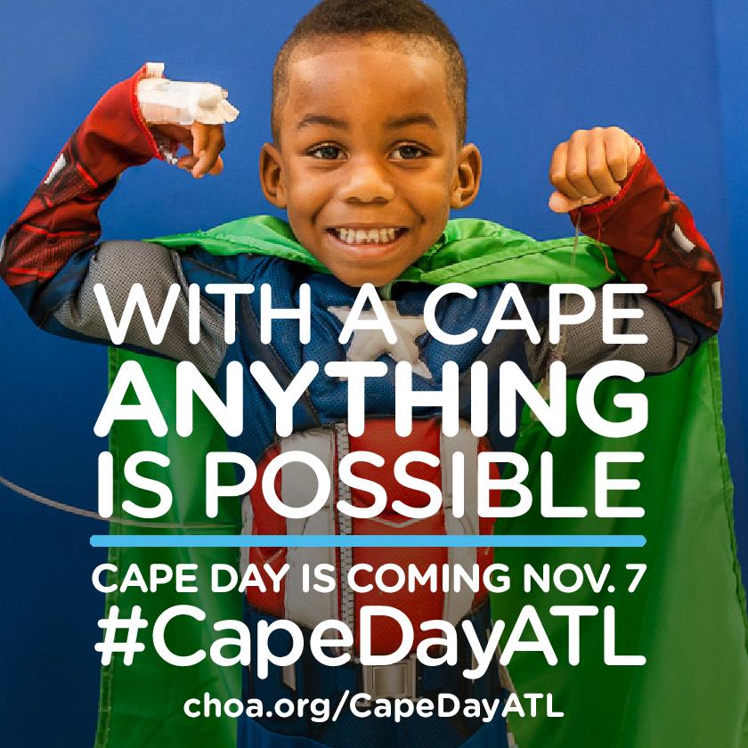
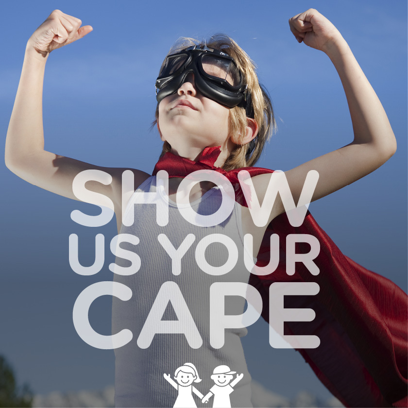
We also created social media graphics with a more lighthearted feel for general brand stewardship. These were meant to encourage consumer participation in #capedayatl.
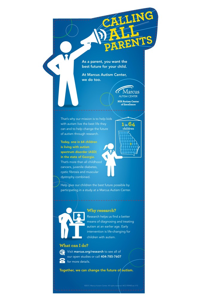
Pop-up banners
Infographics
Tasked with the creation of a safe sleep infographic for National Safe Sleep Month, I came up with the idea of the ultimate bedtime story. Working together, the designer and I developed this fairy tale adventure incorporating the key messages of safe sleeping for newborns. My inspiration was 1980s children’s books and video games.
This 100-year infographic is meant to provide a snapshot of the hospital a century ago while providing current-day comparisons to show donors how embedded Children’s is Atlanta’s history.
Magazines
I was responsible for writing and editing Small Wonders, a quarterly publication for nearly 20,000 donors. I interviewed physicians, employees, patients, fundraisers and community supporters to create authentic, moving content for donor stewardship.
