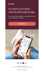
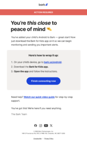
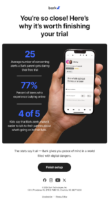
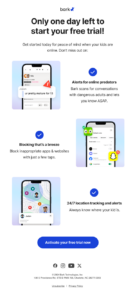
App onboarding email flow
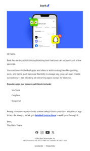
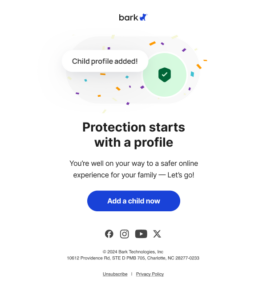
These first 5 emails were sent to help Bark users maximize their usage of the app, helping to stay healthy users by using more features. Using Amplitude, we identified the features that most closely correlated to staying active longer, and focused on explaining them quickly and clearly in these email touchpoints.
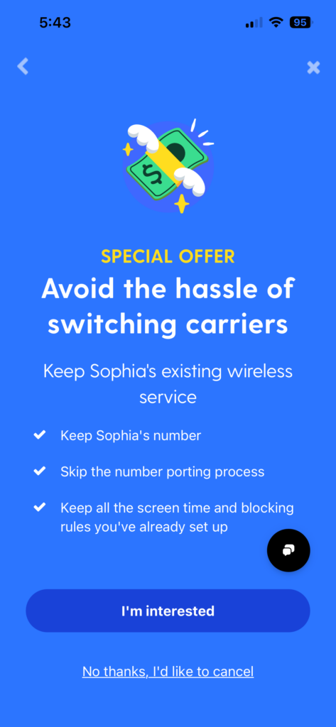
Post-cancelation screen for cell service retention
One way Bark aimed to maintain revenue for canceling Bark Phone users was to offer discounted cell service since they were keeping the device. I drafted copy to support this ask, after researching the benefits that spoke most to users.
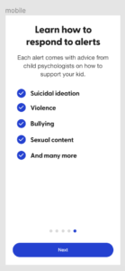
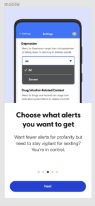
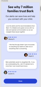
Alert explanation walkthrough
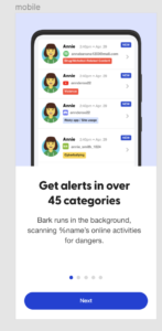
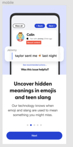
I was tasked with coming with a guided tour of Bark’s alert page in our app. I chose to focus on the key things that parents needed to know to understand what alerts are and how they work. Implementation led to a decrease in churn rate for new users.
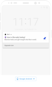
Push notifications
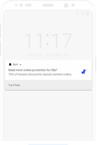
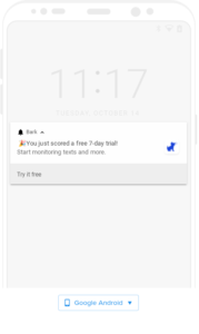
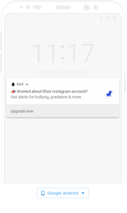
For users who have Bark Jr, they’ll periodically receive push notifications encouraging them to upgrade their account to Bark Premium, which provides more comprehensive coverage. In order to not have people instantly swipe it away as spam, I provided options that would pique a parent’s curiosity, arouse concern, or make them feel like upgrading would help protect their child better.
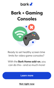
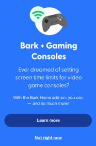
Bark Home informational pop-up modal
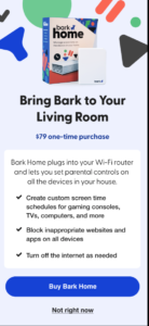
In addition to Bark’s subscription-based services, which cover mobile devices only, parents can purchase a router add-on to bring Bark to home-based devices like TVs, gaming consoles, and more. This can be a little hard to explain, so conveying the value of the Bark Home needs to be done clearly and simply. These screens resulted in a much higher conversion rate for the Bark Home.
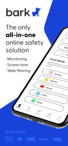
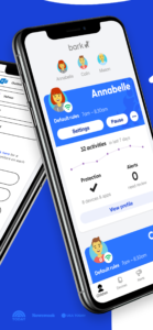
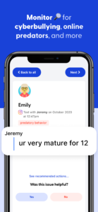
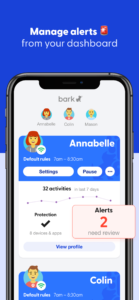
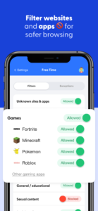
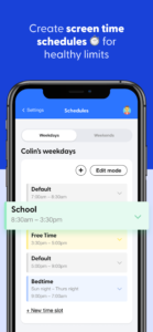
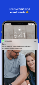
App store screens
These assets incorporate screenshots of the Bark product with marketing copy to help explain the key features.
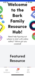
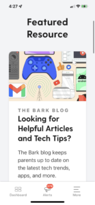
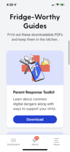
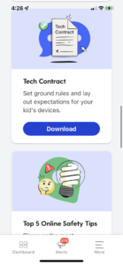
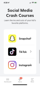
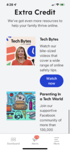
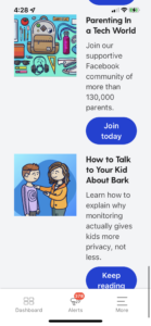
In-app parent resource section
This resource section is meant to give parents pure value and peace of mind, with no up-sells or pushy marketing tactics. I tried to make it as friendly and conversational as possible to help encourage interaction with the collateral, all of which is free. Data showed that the more parents perceived receiving value from Bark, the longer they’d stay customers.
